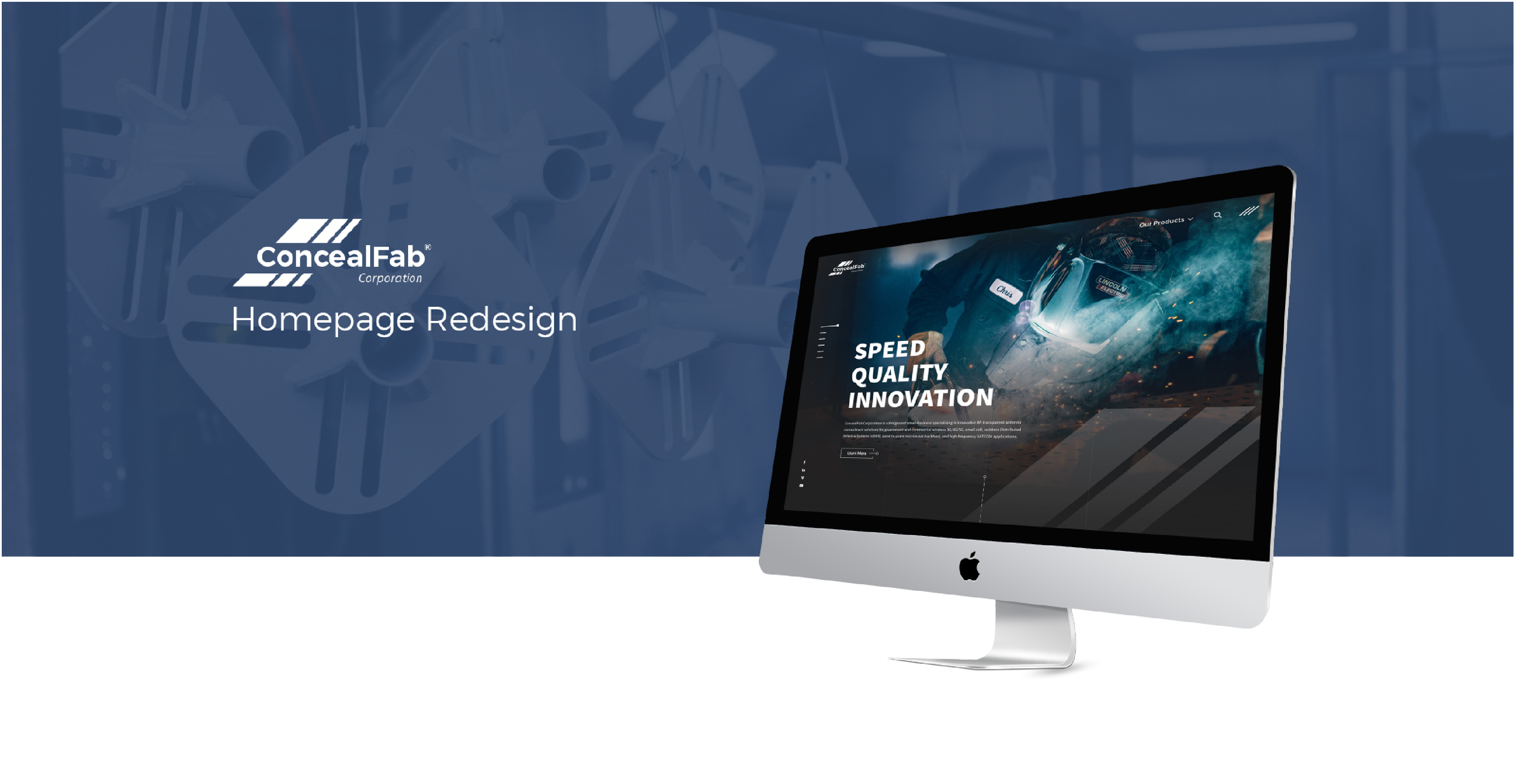
Website Redesign
Overview
ConcealFab stands at the forefront of innovation in 5G concealment and RF solutions.
They recognized that their existing website did not mirror their industry-leading position or their cutting-edge products. Their ambition was to cultivate an online presence that elevated their brand and distinguished them from the competition.
The challenge was that ConcealFab's website did not effectively convey the sophistication and technical prowess of their offerings. Working with prominent clients, they needed a digital platform that would enhance their credibility and accurately reflect their corporate identity.
“We want all three (mission, value, tagline) to come together”
Prototyping
Developed interactive models to preview the design and functionality of the new website. Created wireframes and prototypes to demonstrate user flows and interactions. Utilized rapid prototyping tools to iterate quickly based on feedback.
My Role
User Research
Gathered insights through user interviews, surveys, and usability testing. Analyzed user data to inform design decisions and improve the website's performance. Synthesized research findings to guide the development team and stakeholders.
UI Design
Designed a user interface that aligns with ConcealFab's brand identity and color scheme. Crafted a cohesive visual language for the site that emphasizes modernity and technological innovation. Produced high-fidelity mockups to visualize the end product.
UX Design
Conducted thorough research to understand user needs and behaviors. Structured the website architecture to enhance user experience and facilitate navigation. Implemented design thinking strategies to solve usability issues and improve user satisfaction.
ConcealFab was open to new ideas for their website redesign. They sought a design that was clean, contemporary, and reflected their focus on technology and products. They insisted on retaining their established brand colors and logo. Leveraging this, we crafted a design that featured minimalist typography and made excellent use of their extensive collection of high-quality photographs.
Process - Visual Design
Colors
Fonts
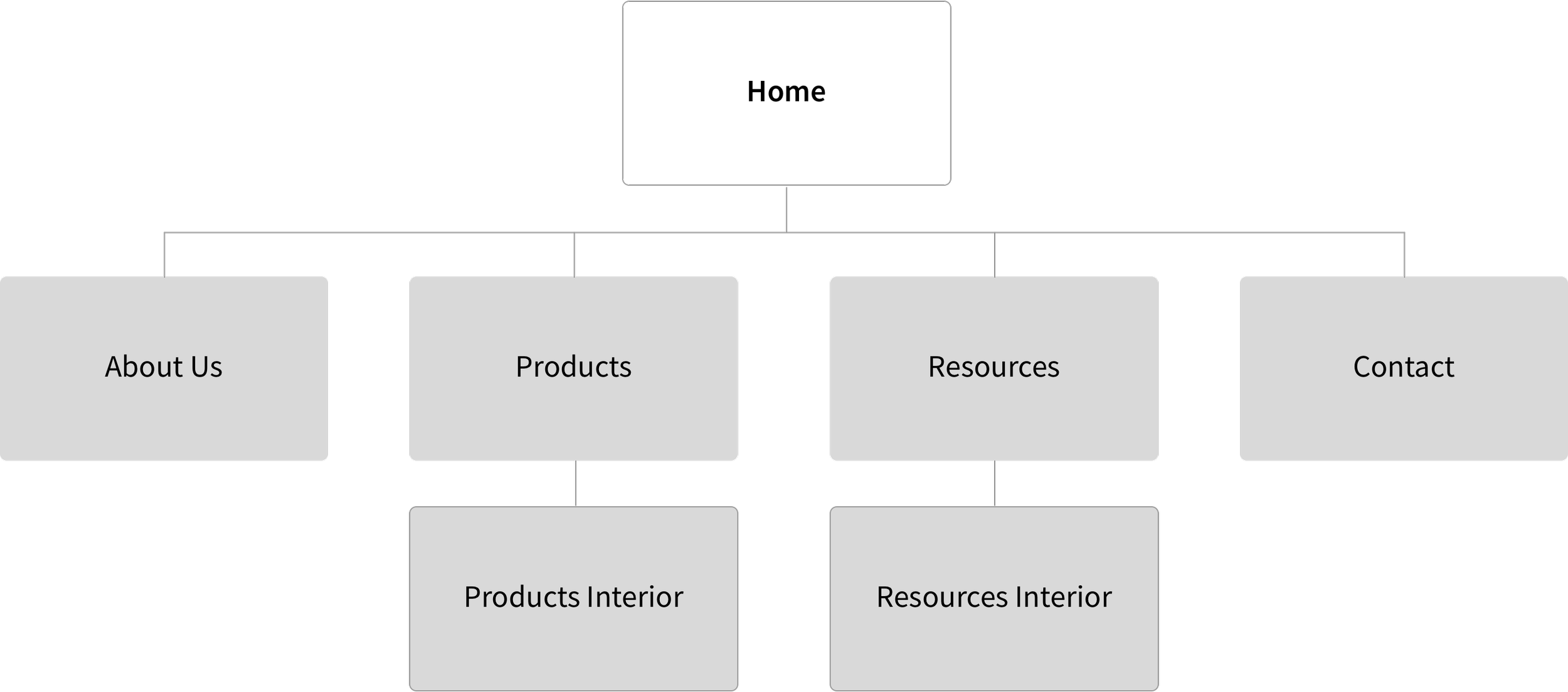
Previously, the website comprised an extensive array of 35 pages. Through a meticulous restructuring process, we streamlined the content into a more navigable and intuitive map structure.
Process - UX Design
Old Design
New Design


